
IDENTITY / LOGOS
Developing ID's is a very involved process. In many cases, particularly with new clients/new products they are hesitant to commit to a comprehensive identity program. We work tirelessly with clients to meet their needs and budget and do our best to give them creative that hits the mark in the market.



Clients: Dial Riverside County 211 & Aquatech (AquaValue) | 2008-2009
The challenge of successful identity creation depends on how open clients are to the creative process, which requires a considerable amount of reflection and scrutiny of their brand, position and voice in the market.
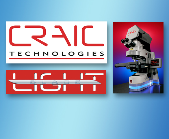
Client: Craic Technologies Inc. | Corporate Identity | 2003-2015
The development of the Craic identity was a relatively quick process due to the clarity of their brand/mission statement. Every iteration of the identity, since it's inception, has been to reinforce and enhance the client's brand in the marketplace.
Client: Pioneer Electronics (USA) Inc. | Pioneer Digital Technologies Product Marks | 2000-2006
Our work with Pioneer was during a corporate re-branding where four decade plus logomark gave way to thier current type-based logo. The marks shown above were product variations on an orbital motif establish with the Voyager set-top.
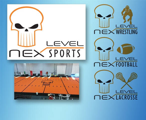
Client: Nex Level Sports | Brand Identity Campaign | 2010
Our client wanted to reflect their specialization and ambitions in the regional sports fitness category. The alien skull speaks to a growing performance youth market and reflects a more aggressive posture towards achieving their sports fitness goals.
Clients: Lahilahi Fine Foods & Centro de Niños y Padres | Identity Programs | 2013 & 2011
One is a packaged organic specialty foods brand for youth markets, the other, a Los Angeles based non-profit early intervention program for children with disabilities. Color and vibrancy the hallmarks of youth-centric organizations.
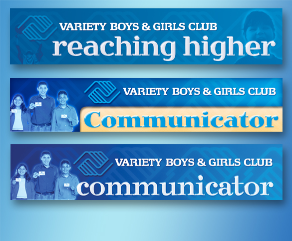
Client: Variety Boys & Girls Club of Los Angeles | Variety Newsletter Masthead | 2008
A motivated non-profit looking to update their communications across the board. While the Boys & Girls Club logo is immutable, they had the flexibility to consider new looks for their print and digital communications.
Clients: Underware Server Software & TeraStor Corporation | Identity Explorations | 2010 & 1996
We have spent the better part of our career working with hi-tech clients, particularly within the Bay Area and Silicon Valley. We are accustomed to working with and helping start-ups communicate new industry paradigms, products and services.
Clients: Variety Boys & Girls Club of Los Angeles & Campion Investments | Logomark and Identity Exploration | 2009
Sometimes old is new again! I always loved integrated banners to logomarks. While nostalgic, they do serve to convey a semblance of history to brands which can definitely benefit identities that are unfamiliar to audiences.
Clients: pTags, Fujifilm Data Storage, Link/Age, Dreamday Financial | Brand Marks | 1999-2006
The variety of clients and the usage of their logomarks and logotypes run the gamut of B2B and B2C applications. We pride ourselves on helping clients establish identities that are memorable and make a positive brand impression.
Detailed branding profiles of Pioneer and Craic are available for download on our work samples page. If you wish to review our creative efforts in Identity and logo work, click here.
© 2015 Lamoraga Communications | 4088 Jefferson Street, Riverside California 92504 | p: 951.977.8483 m: 626.592.0515